-
Overview
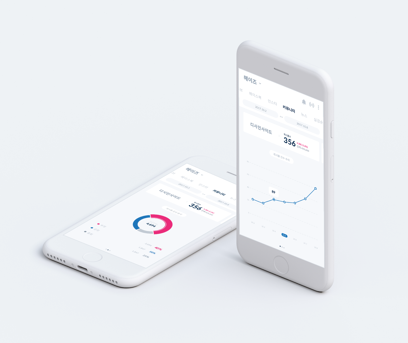
Peter is a web application that provides users with real-time charts, playlists and social data of Korean musicians at their fingertips. It provides actionable music data in real time, which makes users aware of how their songs are consumed on SNS and the web. I focused on creating data visualizations that help musicians who are not familiar with numerical data to understand their data more easily.
-
Client
Space Oddity
My Role
Concept + UX & Design
Platform
Web application
Year
2017
Background
Peter: A Market Analytics Tool for the Music Industry
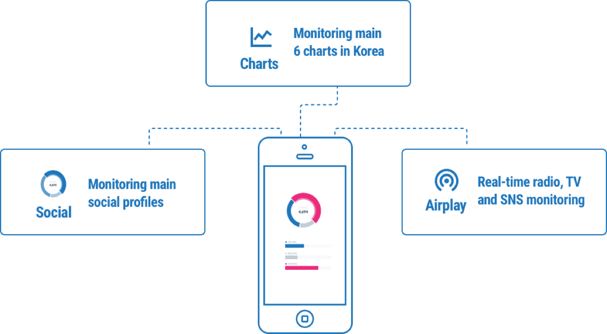
To start the project, it was important to understand the origins of my client's business. Space Oddity, a music entertainment company, found that musicians and their agents wanted to keep track of music consumption and musicians’ popularity. To solve this problem, Space Oddity gathers online data related to musicians and provides valuable consultation to their clients based on the analysis of massive amounts of music-related data. Peter provides real-time monitoring of six charts, social profiles, radio, TV, and several other websites in real-time.
Problem
Peter crawls data from a multitude of sources, but what is the best way to categorize and present this information?
Peter offers actionable data to help users stay informed and make better decisions. The most important task was to organize the data by update period.
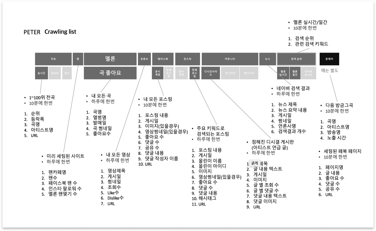
There are so many crawling lists, of which have diffrent update period and they needed to be diffrently displayed in the UI.
Goals
-
Organizing Content
Content should be organized in a way that encourages user interaction, easy skimming, and accessible entry to other menus.
-
Visualizing Data
Since understanding numeric data takes a lot of effort, data should be visualized clearly and simply.
-
Branding
The UI style should be modern enough to entertain users. The original version looked like an old-fashioned, typical analytic solution tool.
Framework 1
Information Architecture Iterations
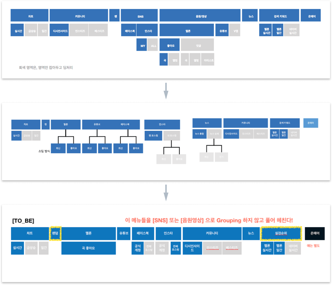
Peter's former UI had several iterations on information architecture. It had several sub-menus of their sub-menus, which made the menus too difficult for users to navigate. I suggested that the menu should be simpler with only one sub-menu. As a result, the last version of Peter’s architecture became much more effective and easy to navigate.
Framework 2
Wireframe
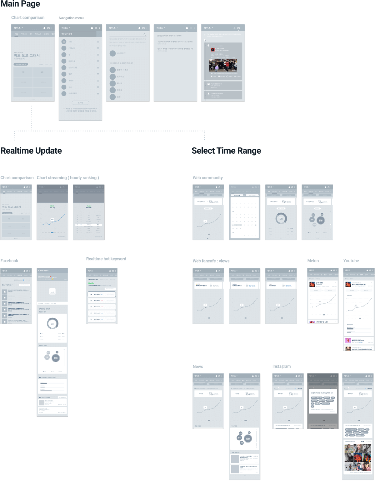
Our biggest challenge in this project was designing the navigation of the data from various sources. The sources of our content were: SNS (Facebook, Instagram), music streaming services (Melon, Bugs, Mnet, Naver Music, Genie, Soribada), and search engines (Naver, Daum etc). To organize the content, we categorized the menu into two main sections. The first one was updated every time the user pushed the renew button, and the other one was crawling data within the range that users manually set.
Design Process
Case Study for Data Visualization UI
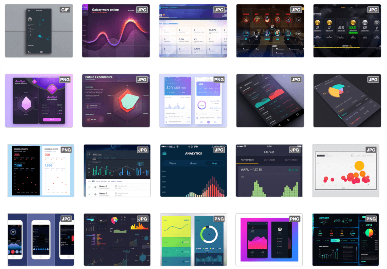
Before committing to a single UI design concept, carefully studying data-related UI design allowed me to suggest the most effective design to my client.
Design Process
Light, Uncluttered, Accent-focused UI Design
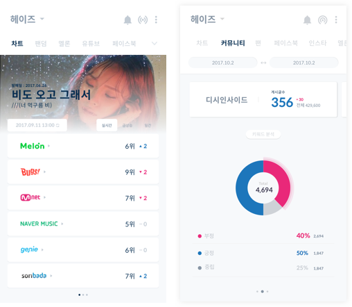
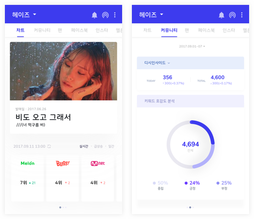
My client and I decided to go with the light, uncluttered, accent-focused color scheme seen in Version A. This UI would help users easily visualize sentiments through the use of a light background and two contrasting colors.
-
A
-
B
-
C
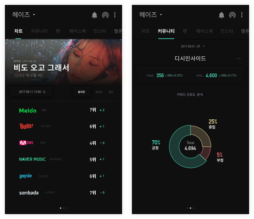
My client were given the choices between 3 UI concepts and they were satisfied with their final decision.
The Final Design - UI
Home Screen
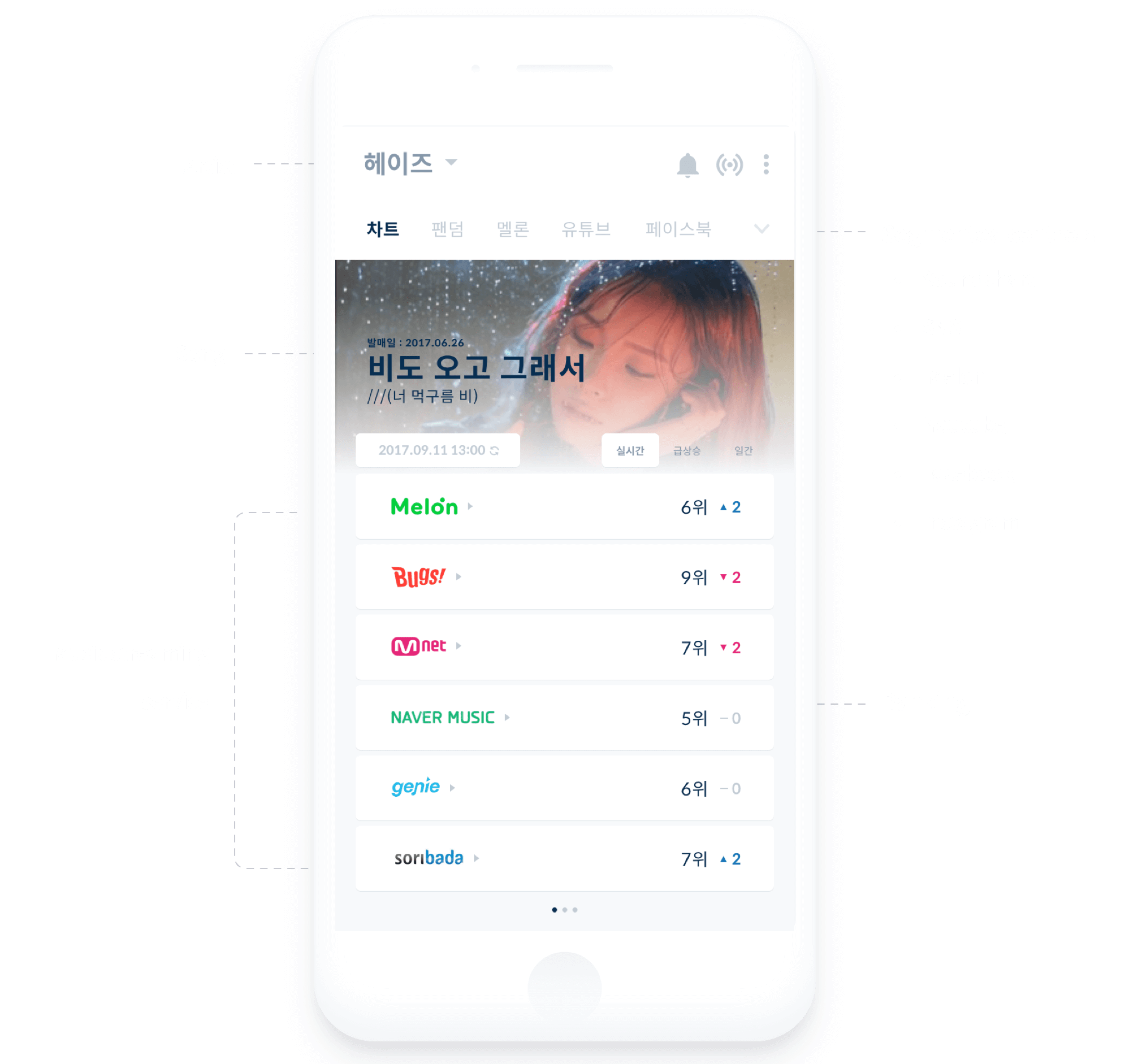
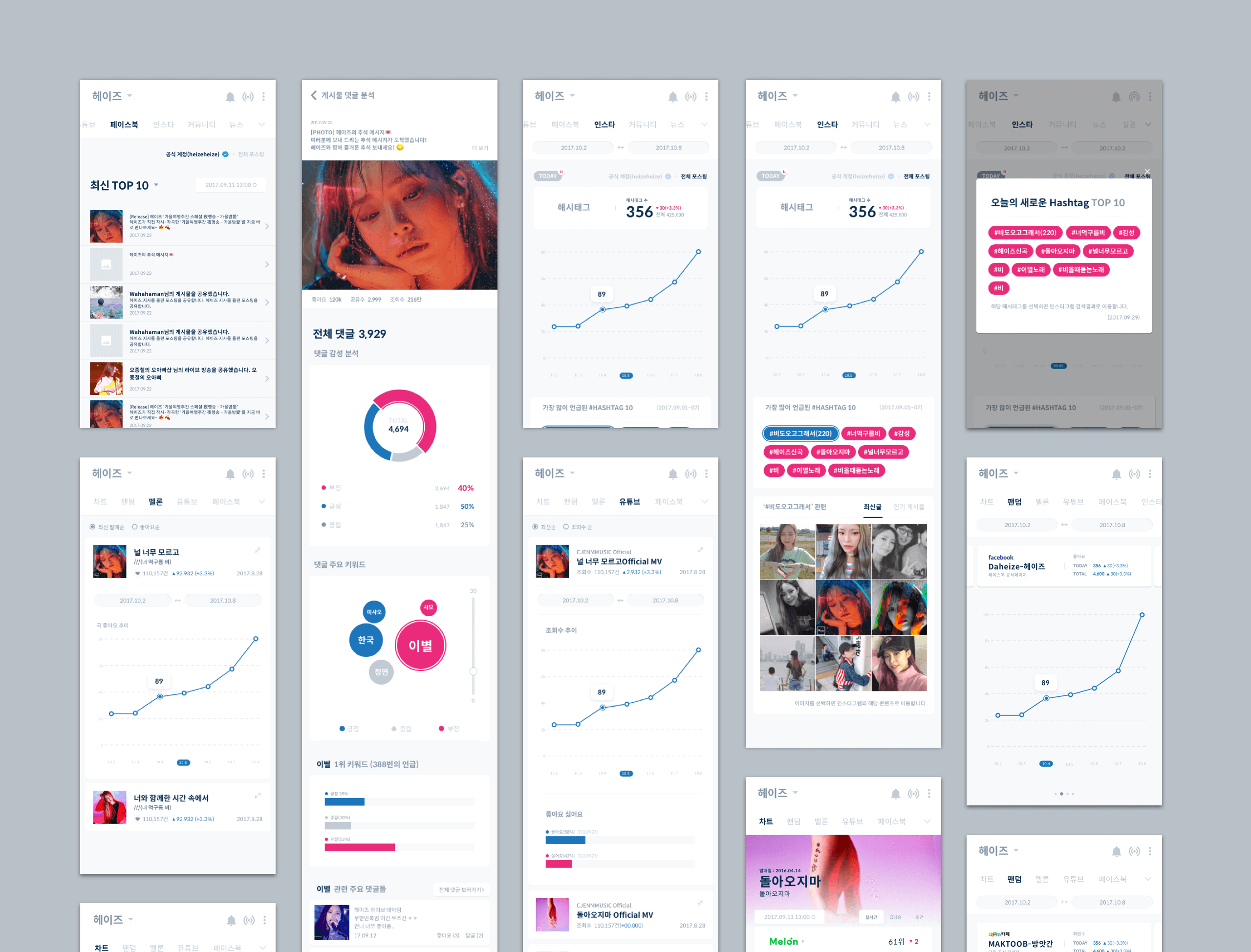
The home screen is designed to encourage user interaction. Swiping left and right allows direct access to other data. The segmented bar has all categories, which allows artists to reach the other data easily by swiping left and right.
The Final Design – Interaction
Soundchart Monitoring
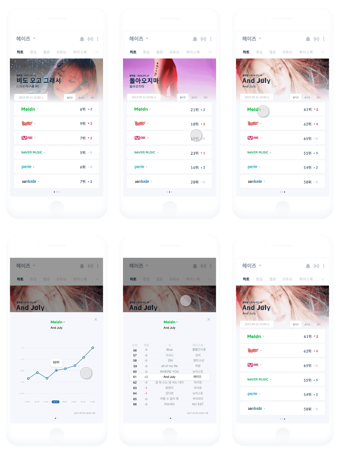
Soundcharts in Peter monitors six music streaming services in real time. It provides an overview for quick reporting, as well as an in-depth view, where users can choose to dive in to hourly rankings status and their rank in the service.
The Final Design – Visual Language
Data visualization- positive, neutral and negative sentiment
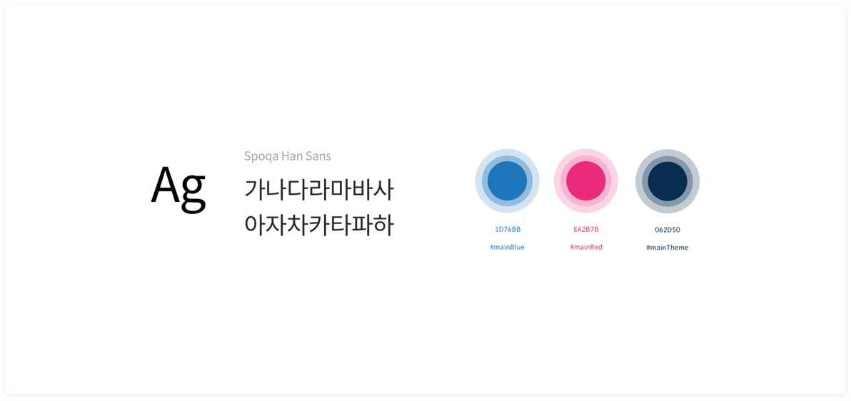
One of the key features Peter offers is that it gives information about how people react to artists' songs. Peter's line graph, pie chart, and scatterplots should help users to detect positive, negative, and neutral reactions. Visualization of sentiment analysis helps musicians and agencies to easily understand positive and negative reactions to their content.
Style guide
-
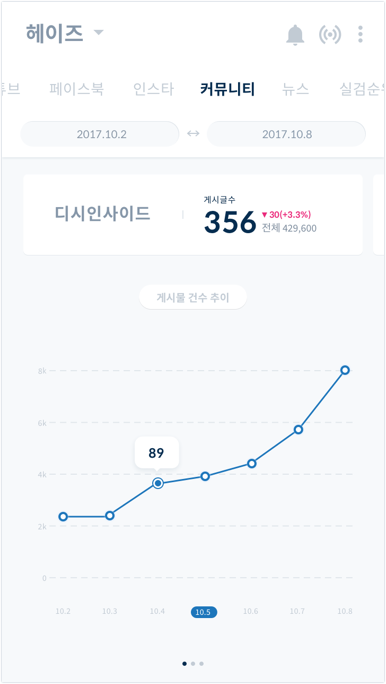
Today Views
-
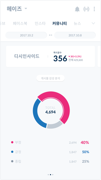
Sentiment Analaysis
-
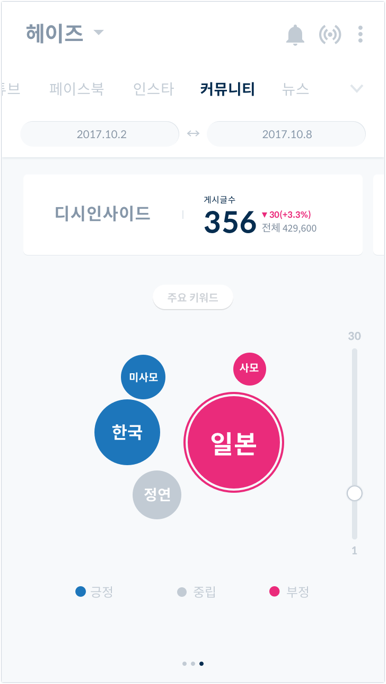
Keywords
Takeaway
Data Analytics Tool At Your Fingertips
The goal was to make it easier and more comfortable for musicians to access their data. We wanted to eliminate the awkwardness and clumsiness they felt when using the old data analysis tool. Since it was my designing a data analysis app, it required a lot of research and case study. Through this process, we were able to produce good results.
