-
Overview
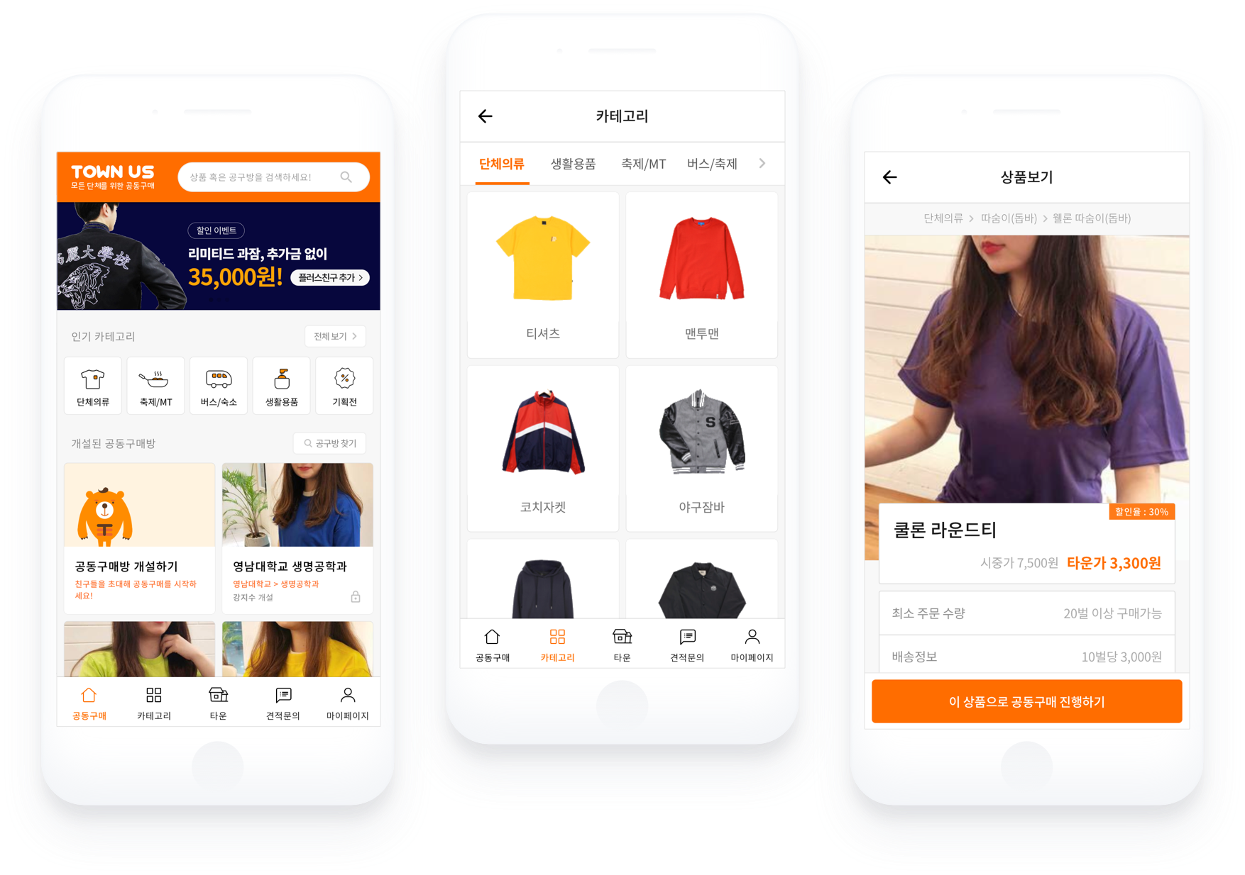
TownUs is a group buying platform that makes it easier for university students to purchase goods collectively in an easy way. Town Company was planning a new platform not only for college students but also as a ‘Group buying platform for all organizations' commerce platform, and I participated in storyboarding, creating user journey map, and UI design for the home screen.
townus.co.kr -
Client
Town company
My Role
Wireframe, UX improvement
Platform
Web application
Year
2017-18
Undestanding
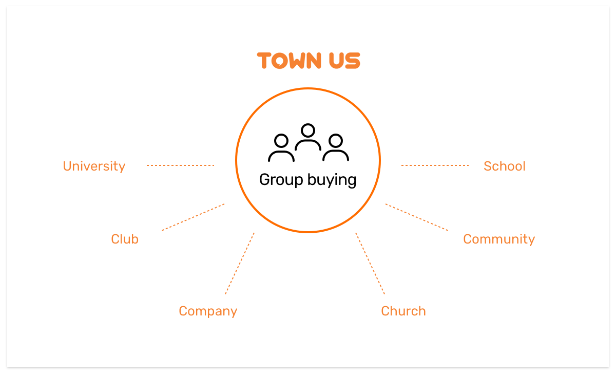
TownUs 2.0: A group buying platform for all organizations
The Town Company has started the TownUs 2.0 project to become a group purchase commerce platform for all groups as well as college students. There was a lot of planning to change to reflect business strategy changes in service. Among them, new UX improvements in the purchase room opening and buying process were needed.
Opportunity
Complex Group Buying, How to make it easier?
It is simple to purchase products from most general commerce websites. You can select a product and purchase
it. However, purchases in TownUs are not possible without going through a"purchase room." It is a
virtual space where customers bring people to buy products at the lowest possible prices.
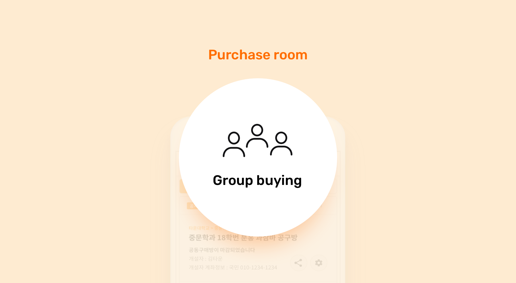
We use a purchase room to create a virtual space for customers to collect their products at the lowest possible prices. To buy products, customers first enter the purchase room.
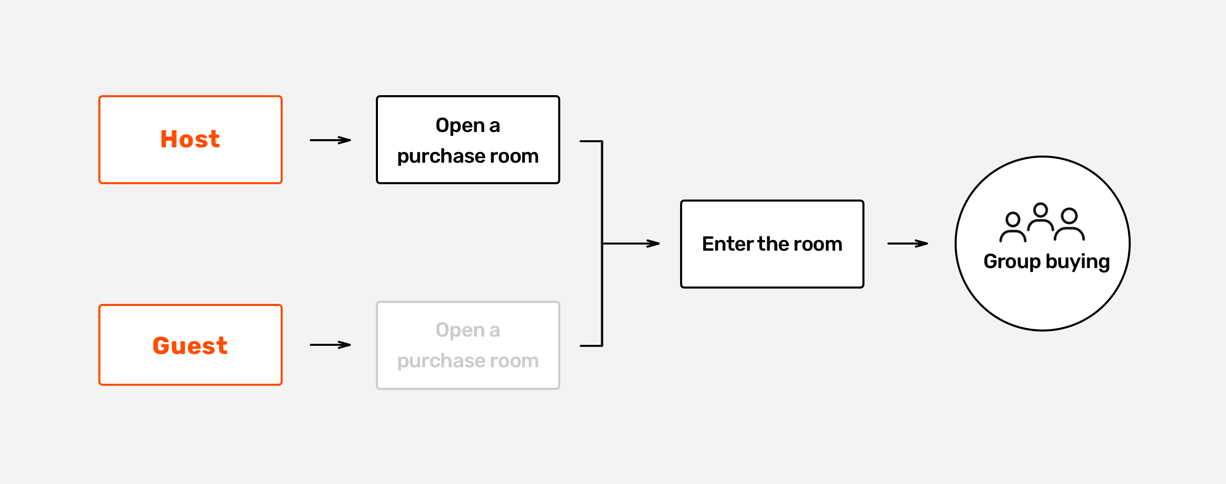
There are two ways in which a customer participates in the group buying process. A customer can be a
“host” who first launches a purchase room and then gathers people to proceed group buying. It is also
possible to participate in an already established purchase room as a “guest.”
We concluded that launching a "purchase room" should be much more friendly for a host. If a host can launch a room easily,
they will eventually bring more users into the platform.
To find a better solution, I created a user journey map to analyze the overall UX flow and find any
painpoints.
Research & Problems
Customer touchpoint analysis of existing group purchase process
We investigated every touchpoints on the user journey map and discovered a lot of problems with the existing purchasing procedures.
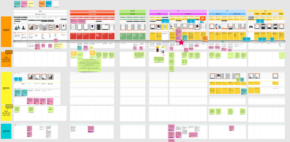
As-is
The buying process was very long and complicated, as it provided only one route for hosts to proceed to group buying.
As-is
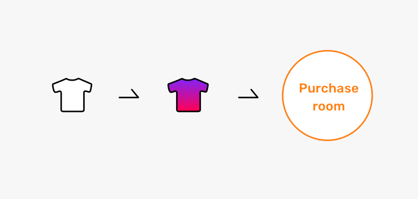
(1) Select a product - (2) Custom clothes design
(3) Launch a room with the design - (4) Start group buying
Users needed a lot of patience to follow the entire long flow. We concluded that we need to create more
routes for users to initiate group buying.
Solution
Providing the host with many routes to start group buying
I created three variations of the existing group buying process. My intent was to give more choice and convenience to users who might have different needs.
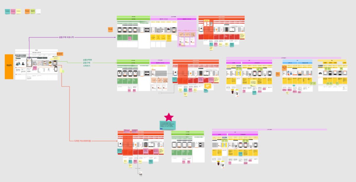
To-be
-
Variation 1
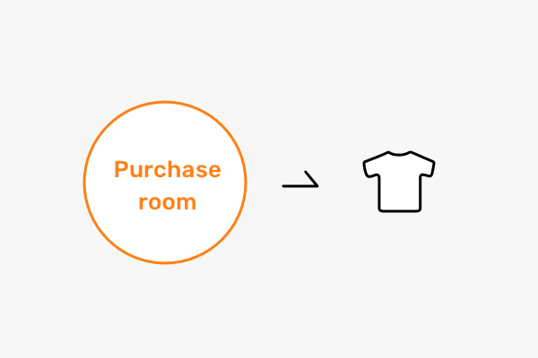
A user launches a room and then adds a product to proceed with group buying.
Target user : Return customer
This host has already completed a group purchase in TownUs and wants to launch a room again.
-
Variation 2-1
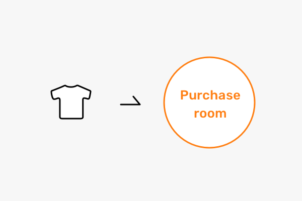
A user chooses a product first and then launches a purchase room.
Target user : Novice
This host doesn’t have basic knowledge of the group buying process on TownUs. They normally expect to buy products without going through a "purchase room."
-
Variation 2-2
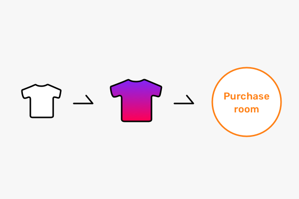
Before choosing a product, a user tries to design their own clothing using the t-shirt customization tool.
Target user : Experimenter
This host wants to create their own design before selecting a product for group buying.
Final Design
Group purchasing starts from the home screen
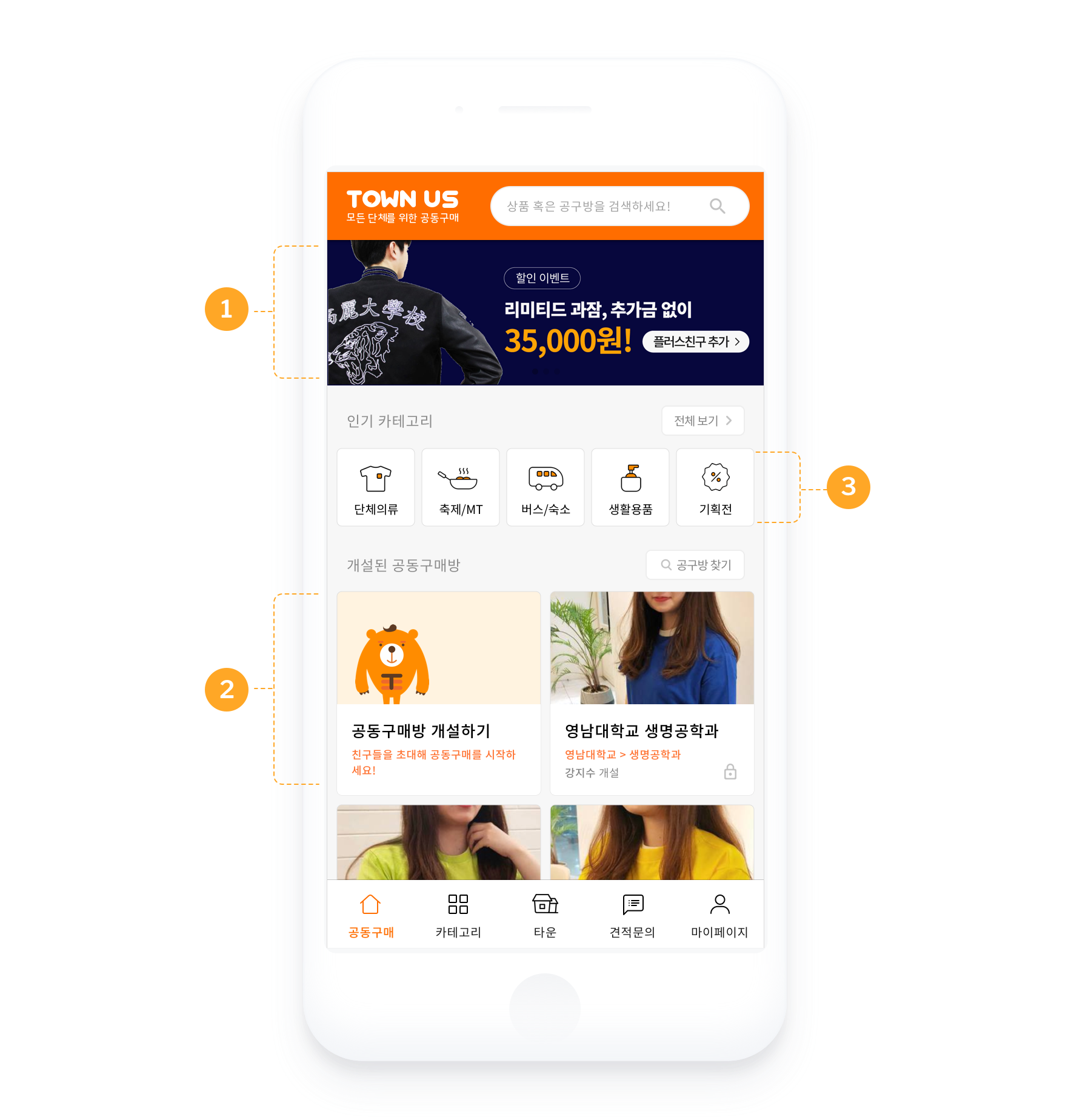
-

- Promotion Banner
- Process banner shows the ongoing promotion on the home screen.
-

- Launching a room button
- The direct route for host to launch a purchase room on the page.
-

- Product category
- Like other general e-commerce sites, product categories have to be displayed on the main page.
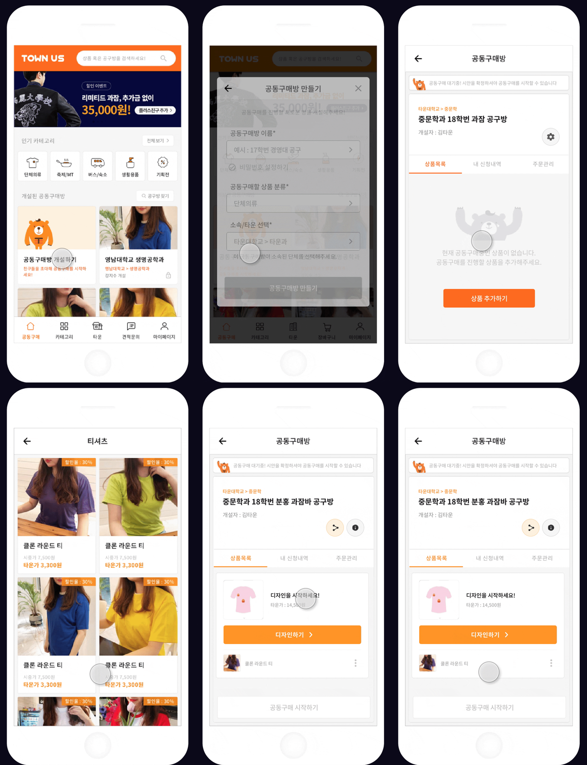
1. Launching a room first
I placed the button for launching a purchase room on the home screen so that users can open a room without having to go through product categories.
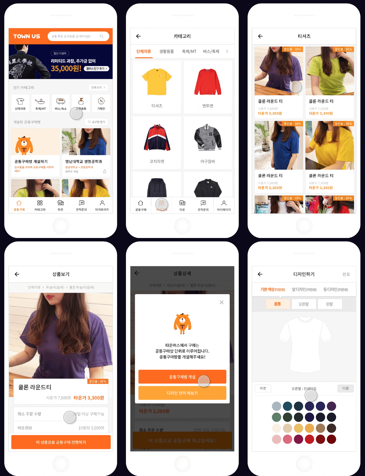
2-1. View a product and launch a room
2-2. Use T-Shirt customization tool
Users can either choose to launch a room with the product or to use the customization tool before launching a room.
Takeaway
Beyond the e-commerce user experience
Because the UX of TownUs is very different from that of ordinary commerce, it was necessary to bring in the common UX of
the existing commerce, but still make use of the features only offered by Towus. It was a challenge
to communicate new concepts to users, such as a "purchase room."
We spent a lot of time investigating every painpoint of users on the user journey map. In the
end, we were able to produce a home screen UI that implemented the solutions to these problems.
Partnering closely with the commerce team ensured successful delivery of the project and also
resulted in increased renewals.
