-
Overview
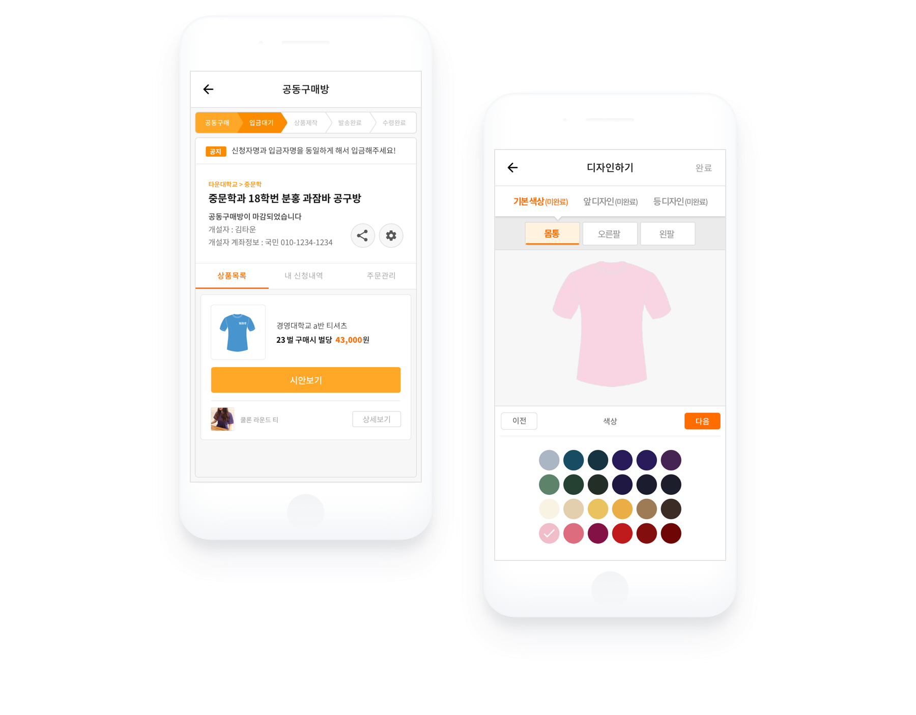
TownUs is a group buying platform that makes it easier for university students to purchase goods collectively in an easy way. Town Company was planning a new platform not only for college students but also as a ‘Group buying platform for all organizations' commerce platform, and I participated in storyboarding, screen design and building a design system for this project.
townus.co.kr -
Client
Town company
My Role
Wireframe, UX/UI Design
Platform
Web application
Year
2017-18
Research & Problem
How can we consistently design UI renewals?
The first goal was to improve the design customization tool to help make it fun and easy even for first-time users. Secondly, it was necessary to renovate the existing purchase room UI to more intuitively reflect the group purchasing process. As I began to work on this UI renewal project, I started to think that Townus needed standardized components. This would enable them so as to spend less time focusing on style and more time developing a better user experience.
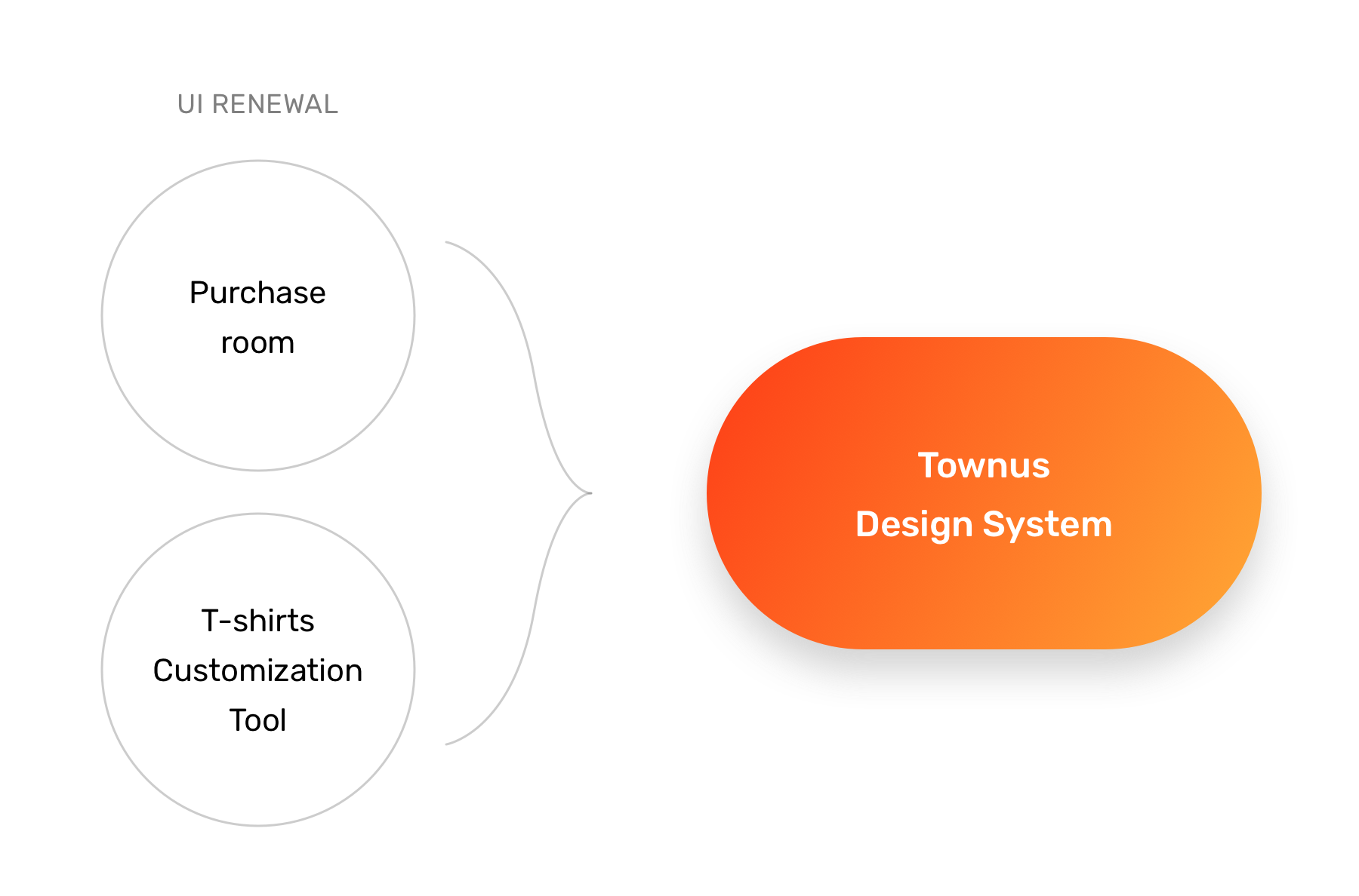
I built a design system alongside the purchase room and the updated customization tool that documented implementation and design guidelines.
UI Renewal 01
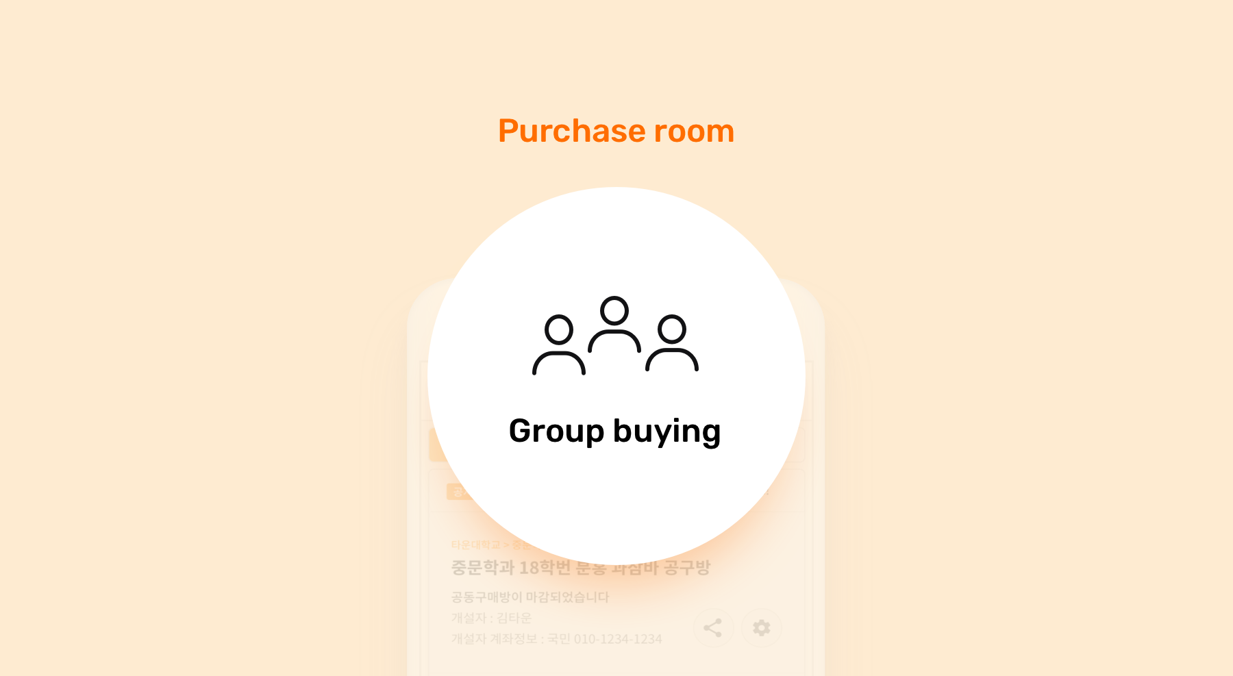
Refreshing the Purchase Room
It is simple to purchase products from most general commerce websites. You can select a product and purchase
it. However, purchases in TownUs are not possible without going through a"purchase room." It is a
virtual space where customers bring people to buy products at the lowest possible prices. Our goal
is that the refreshed purchase room should enable users to navigate the entire buying process without
any help from the CS team.
Step 01 : Identifying Painpoints
Reexamining Every UI Elements
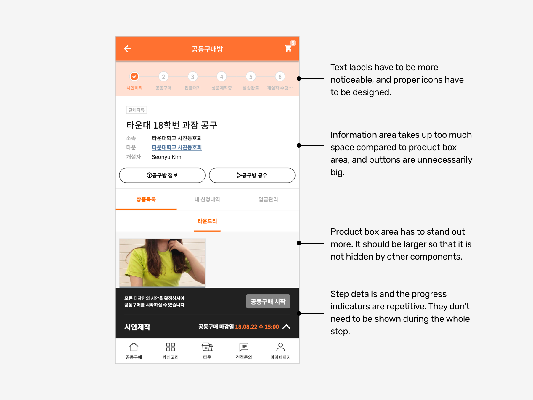
I analysized the painpoints of the previous purchase room UI and
carefully rearranged and redesigned all the UI elements.
Step 02 : UI Design Explorations
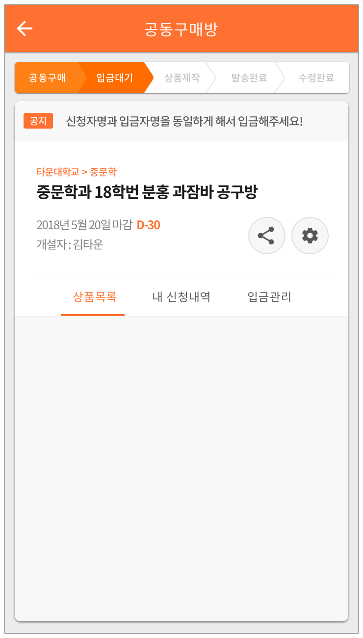
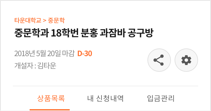
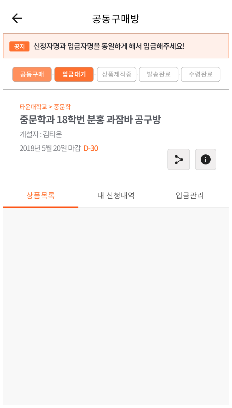
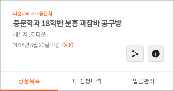
Exploring possible layouts for the purchase room's UI
To improve the UI of the purchase room, I made several variations, applying different color schemes, UI structures, and styles.
-
A


-
B


-
C
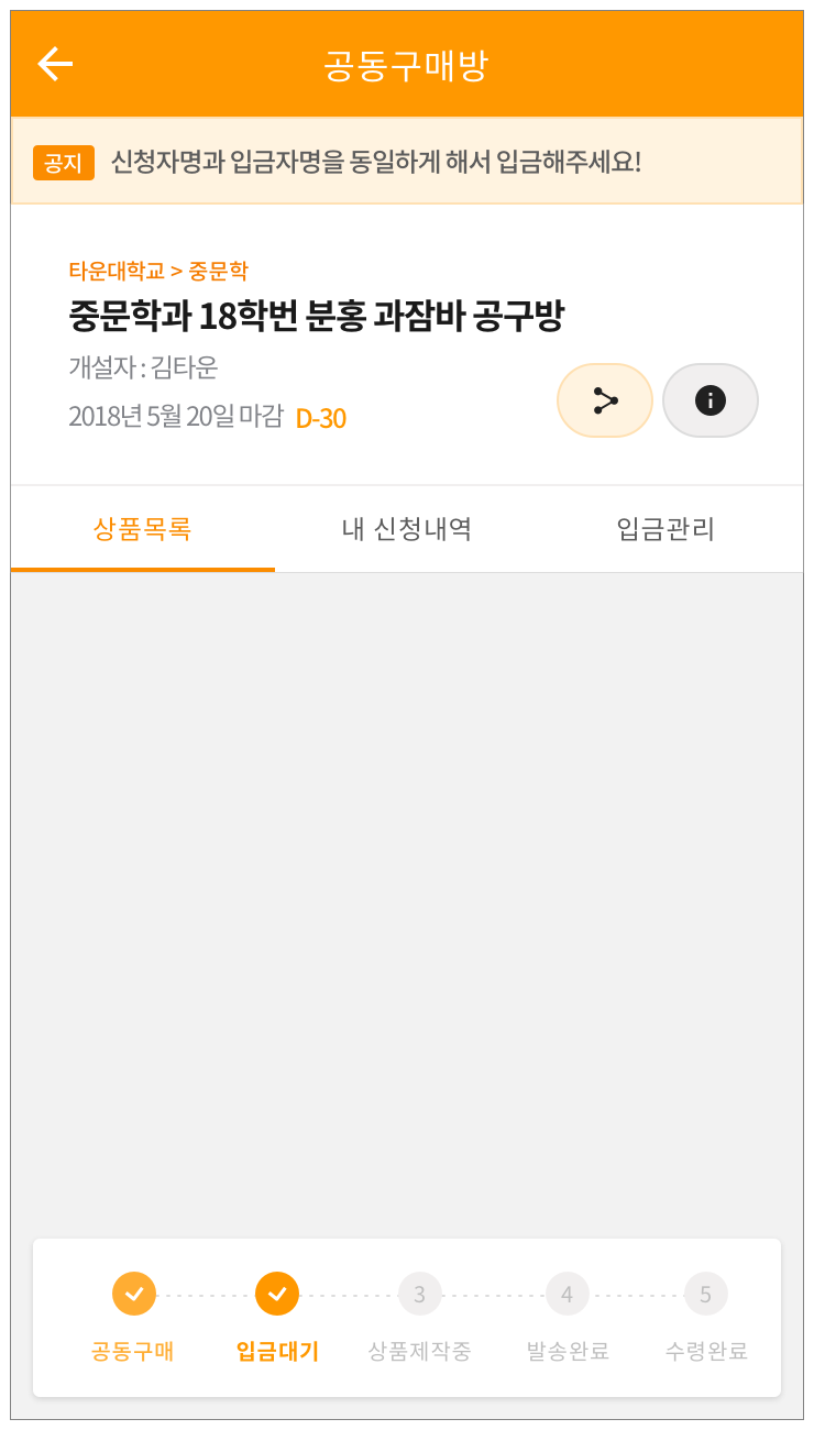


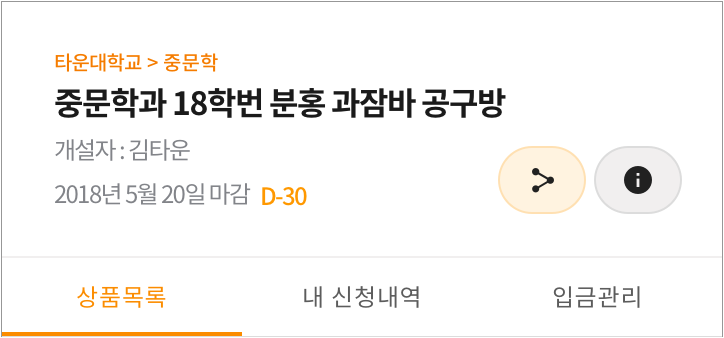
Compare the three versions of the different UI elements by mousing over them.
Adjustments made to potential layouts
1. Placed UI elements in a different layout to test which placement is the most visually appealing.
2. Adjusted the scale of the UI to demonstrate proper information hierarchy.
3. Adjust the area to obtain a better view of the products.
4. Provided a progress indicator to inform the user how many steps have to be completed before proceeding
to the buying process.
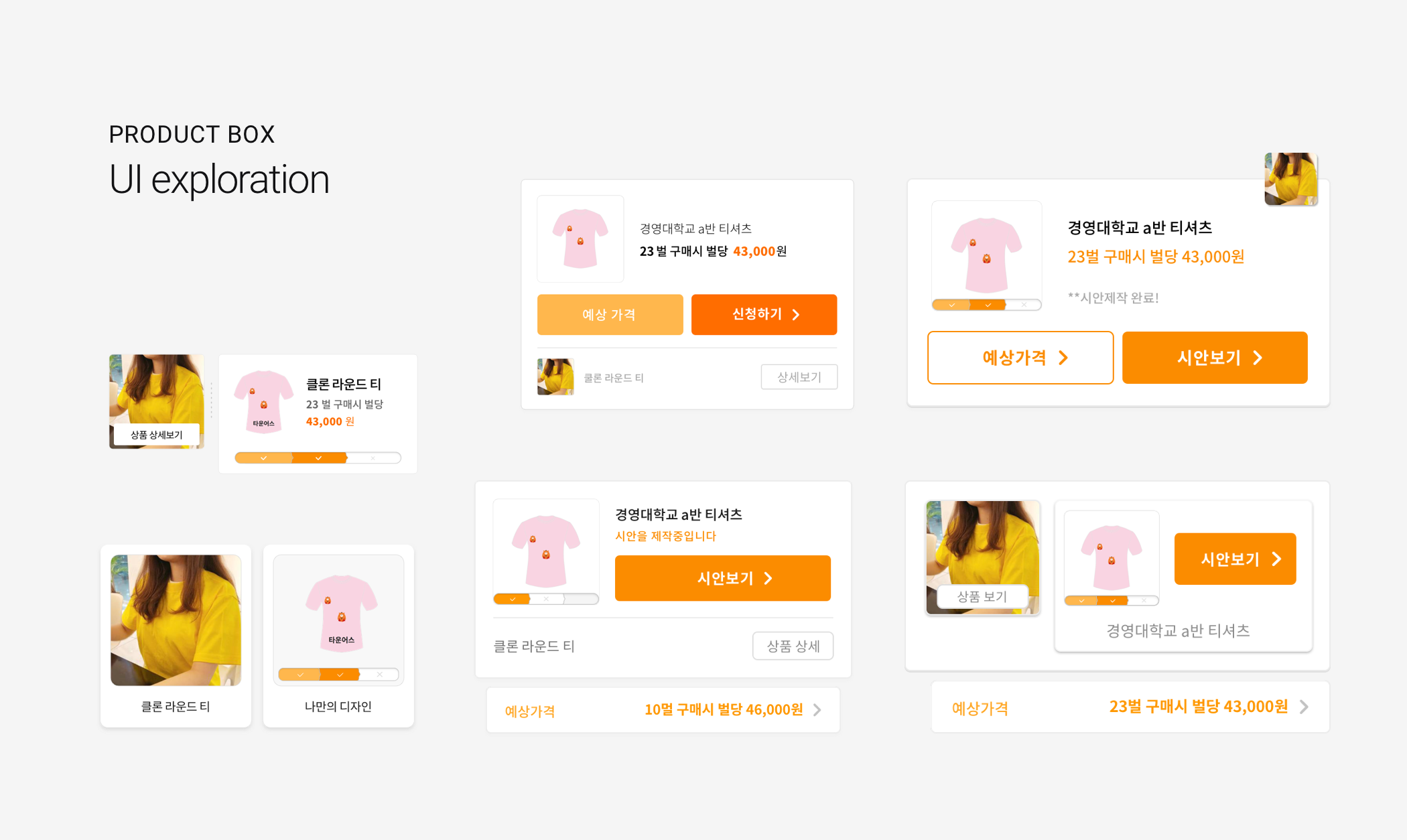
The product box had to display various components, including product preview, custom design preview, the changing price in real-time, and the status of the custom design.
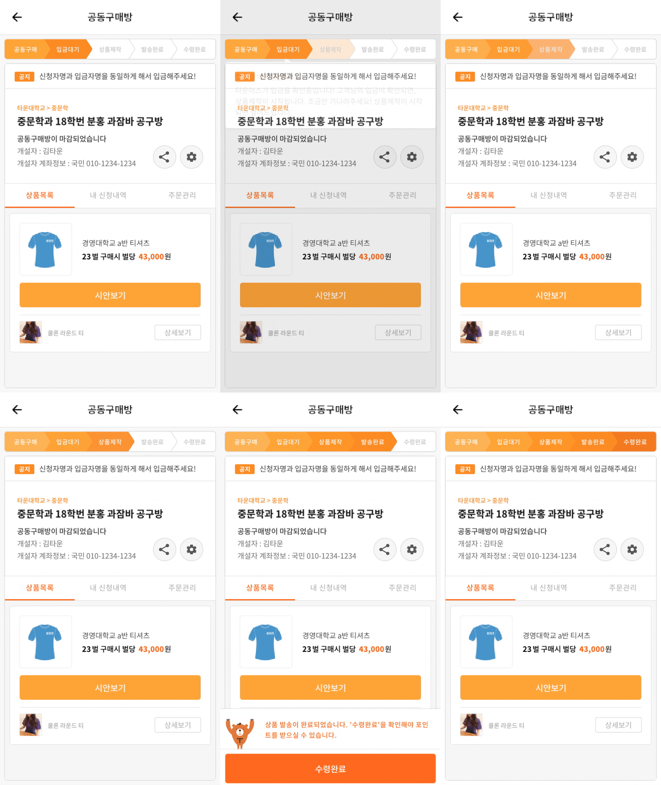
Final Design
Group Purchase Room
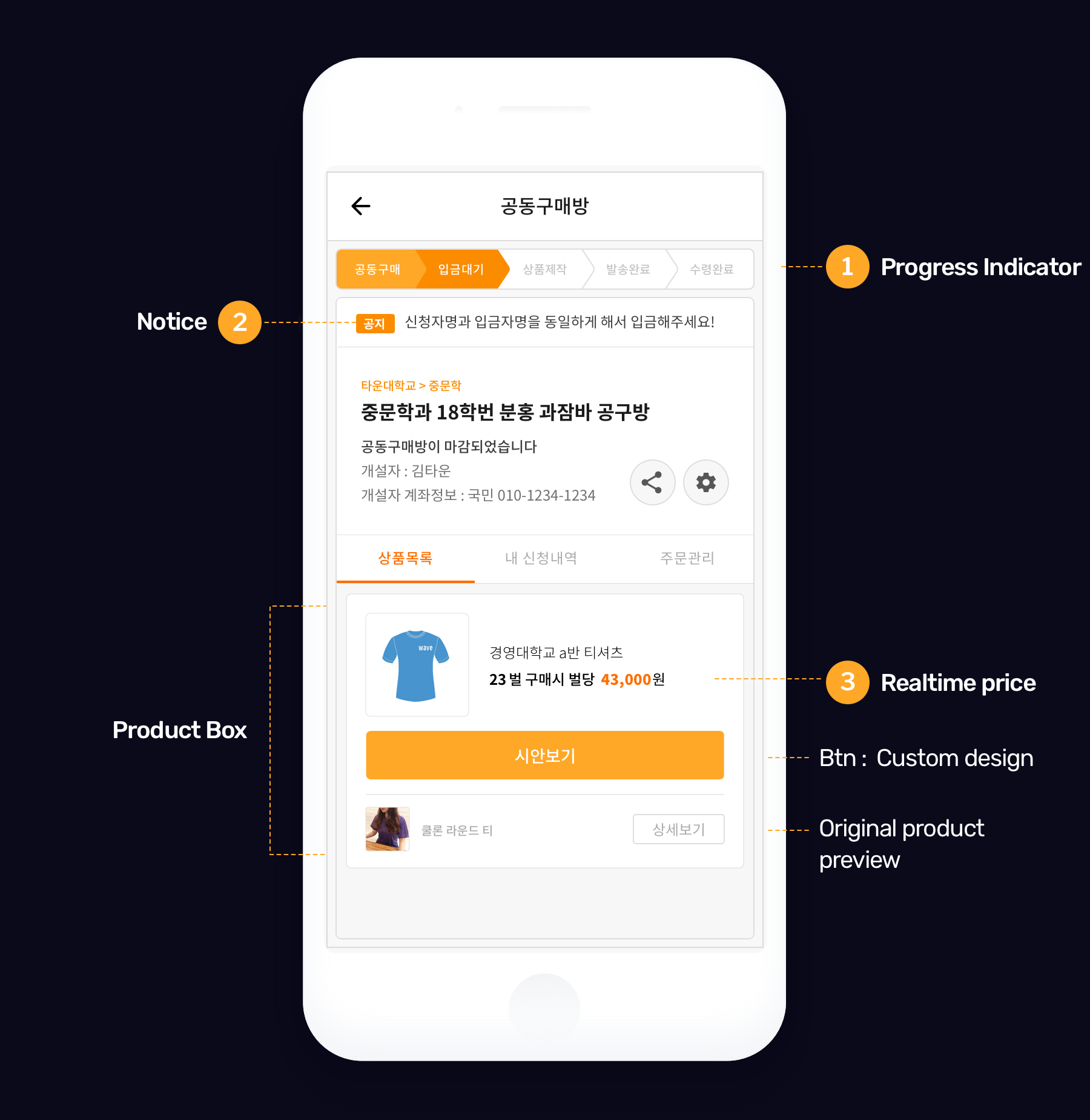
-

- Progress indicator
- Describes the process at every stage of the room, such as ordering product, room closing, depositing, and receiving the product.
-

- Notice
- Informs the host's guests about the group purchase.
-

- Realtime price change
- Shows the price change in real time, according to the number of people participating in the group purchase
UI Renewal 02
Refreshing the T-Shirt Customization Tool
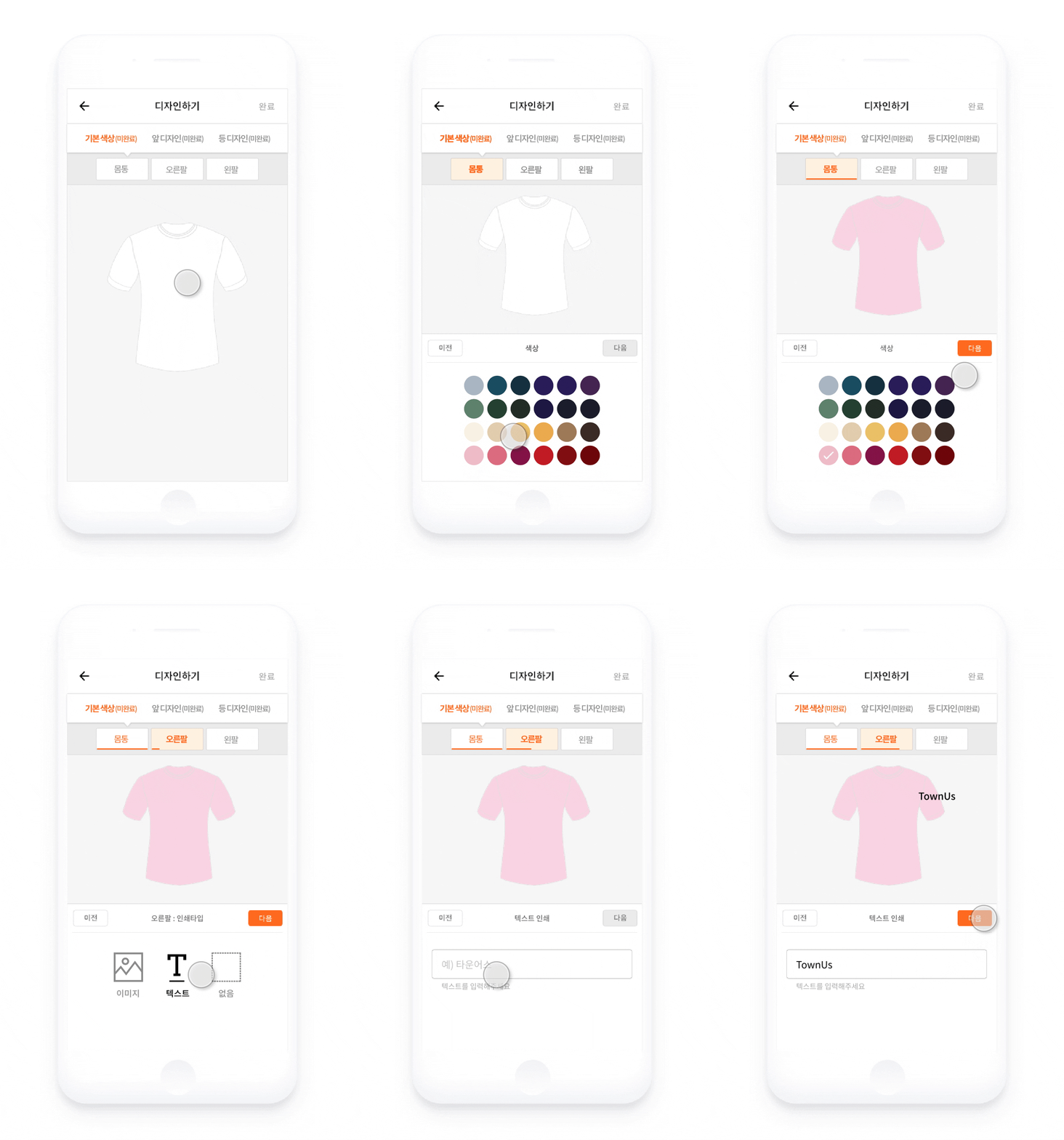
One of the main features that Townus provides is its t-shirt customization tool. Users can choose the color of the product
or change the location on the product where they want to add clip art, images, or text. This features
gives Townus a competitive edge over other services in the Korean market in that it gives users the
opportunity to design custom products before they actually proceed to group buying.
I worked closely with the commerce team to refresh the existing customization tool experience, which
had not seen updates since its initial design two years ago.
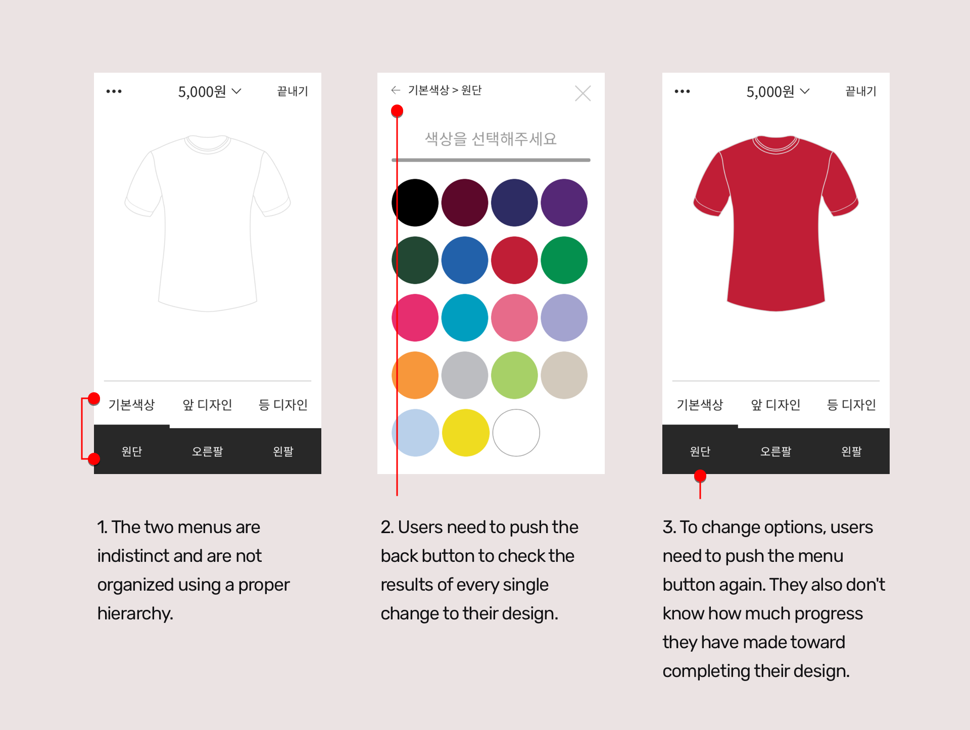
Step 01 : Identifying painpoints
-
Instant Application
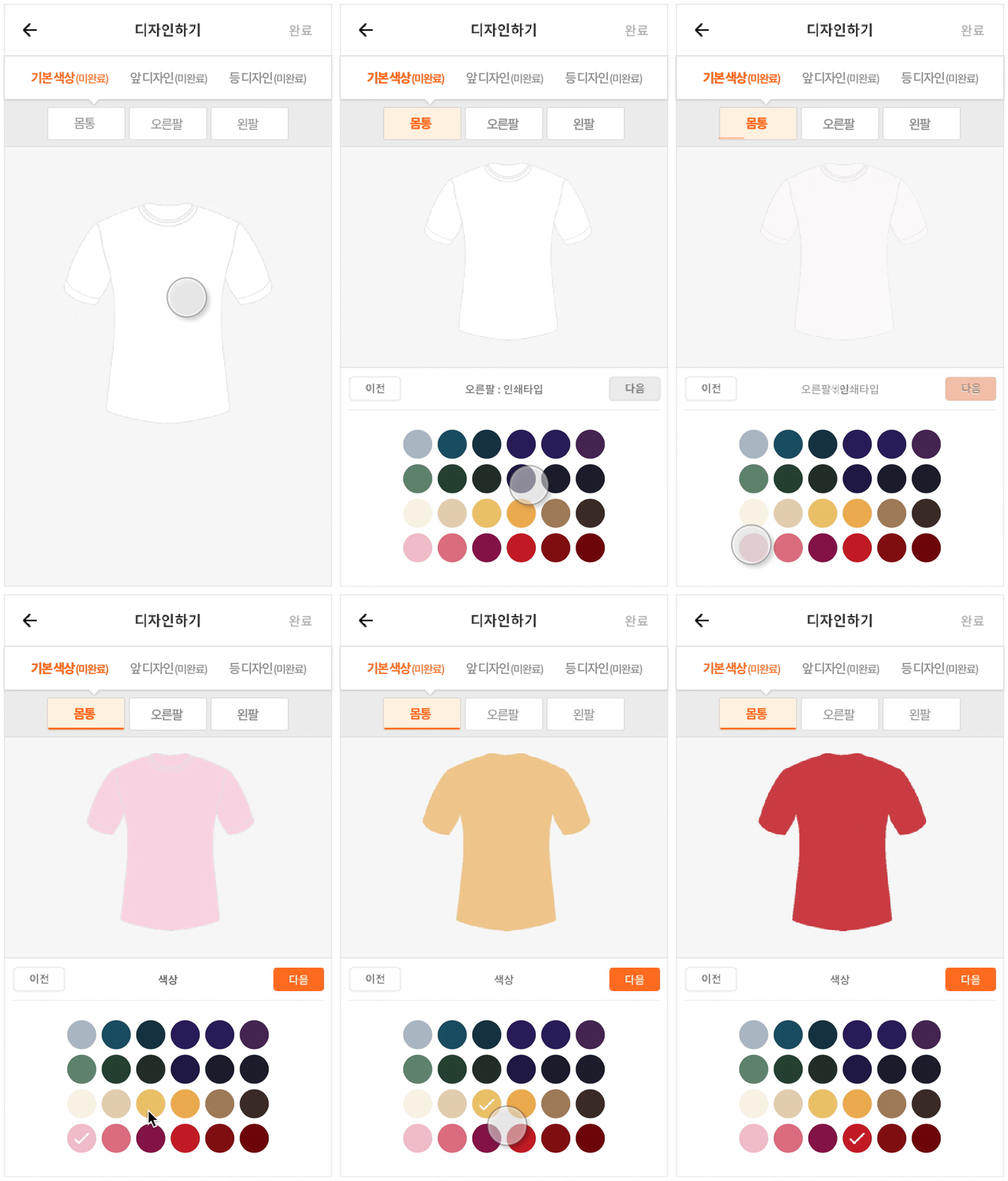
I placed the options and the design results together so that users can see how their design is changing.
Next & Previous buttons
In the options area, next and previous buttons enable users to move to previous or next page.
-
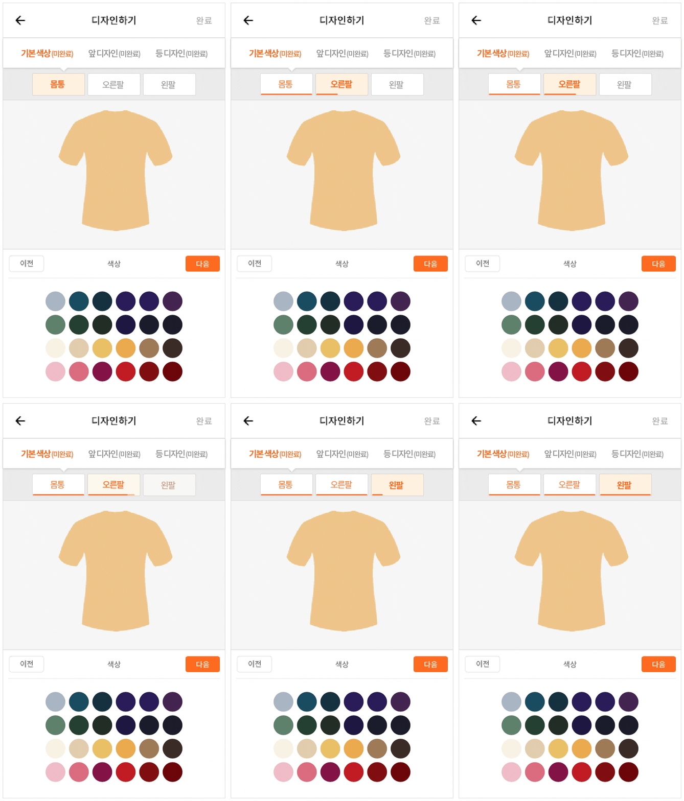
Progress trackers
Thanks to the bars which show percentages, users can see how much progress they have made toward completing their design.
Hierarchy
The redesigned menu more distinctly shows the user which options are most important.
Step 02 : Solutions
Final Design
User friendly customization tool
I wanted to make the tool more interactive and fun to use by showing design changes in real time. As we continued to alter the design, our main feature became more powerful. 💪
“ While refreshing the UI,
it was getting painful to repeatedly design without any standardized guidelines. As a result, I built
a design system alongside the UI redesign. "
Design System
Establishing the design system's style guide
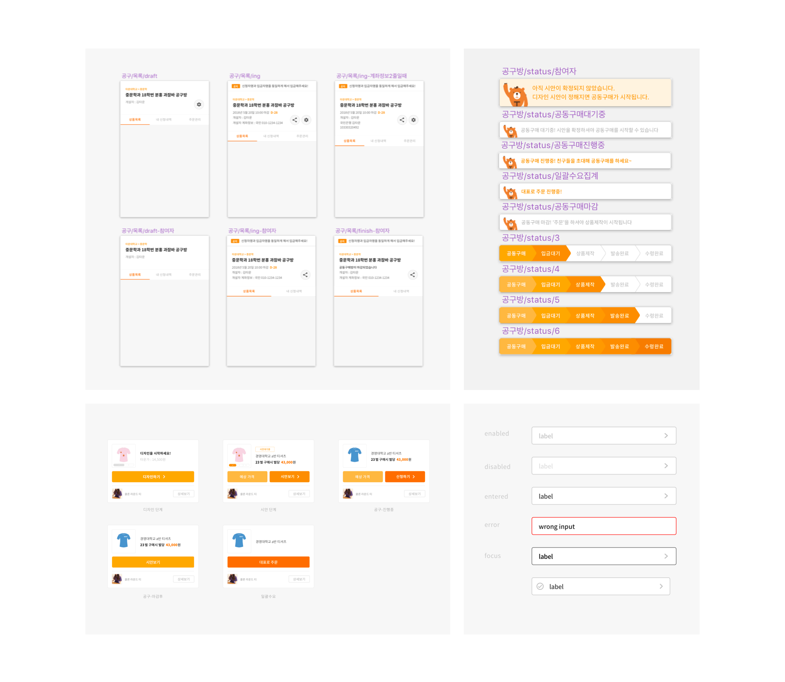
There was no written documentation of any style guide when I started this project. The main goal of this design system was to make components which are reusable and can be coded even without a designer.
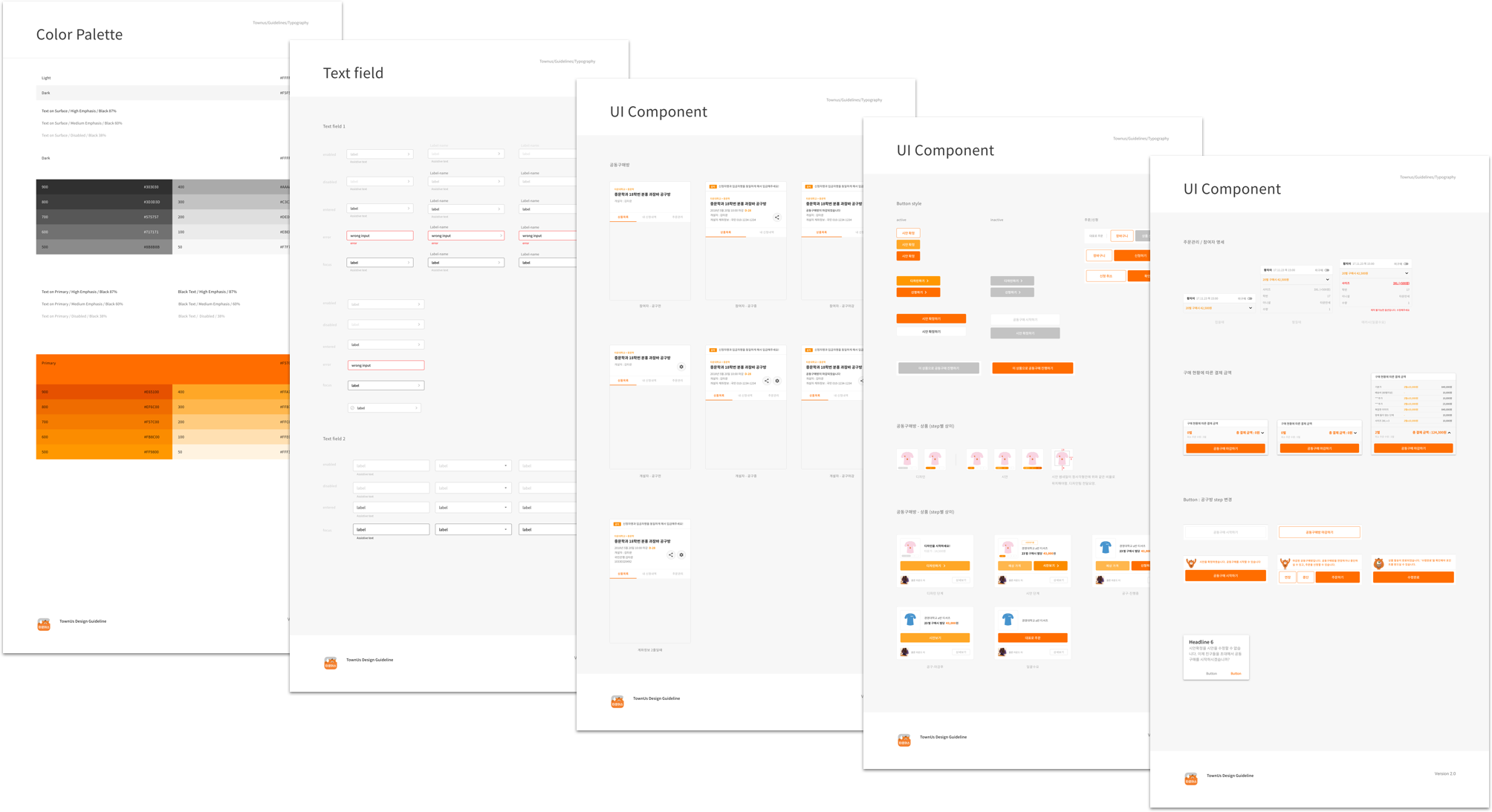
Gaining a lot of inspiration from material design, I was able to design our own version of a
style guide document. The components like buttons, text fields, main UI layout were exported
to Zeplin as components.
Takeaway
Cover the flows with consistent UI design
Because the UX of TownUs is very different from that of ordinary commerce sites, it was necessary to bring in common UX elements
of existing commerce sites while still making use of the features only offered by Townus. Presenting
a new concept through the UI that was not familiar to customers, such as a "purchase room" or a "design
customization tool," was a challenge.
Redesigning the UI and building a design system at the same time was also an exciting challenge.
However, it was definitely worth it to work on both projects, which empowered the engineers to code
efficiently without me. Now that the contract is over, engineers still work with the guidelines that
I made, and they are quite satisfied with their improved workflow.
